 Download DLL and Test Project
 Download Source Code for Controls
Introduction
Previously, I wrote about using an owner-draw combo box to implement a color picker control. In that article, I stated that an owner-draw combo box seemed like the easiest way to implement a color picker for WinForms. I also stated that, perhaps, I might someday create a fancier color picker that does not fit within the rigid structure of an owner-draw combo box. It looks like that day has come.
I started playing around with different ways to implement a more sophisticated color picker. Right away, the first issue I had was that I realized I needed different types of controls. For example, sometimes I just wanted a button, and other times I wanted a drop-down palette. In addition, I could immediately see that it would be useful if I could place a color picker control directly into a WinForms ToolStrip container.
The result was no less than four custom controls. I compiled them all into a single file (ColorPicker.dll). Two of the controls can be placed directly on a form, while the other two can be placed in a ToolStrip container. There is a fifth control, ColorDropDown, which is private. This control implements the logic for the drop-down window and is used by those controls that implement a drop-down palette.
ColorDropDown inherits from the ToolStripDropDown control. Not only is this a great control for implementing any sort of drop-down or pop-up window, but it also works with ToolStripDropDownButton buttons, which means it can work in a ToolStrip container.
The ColorPalette Control

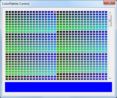
The ColorPalette control is really the core of all the ColorPicker controls. It allows the user to select from a palette of colors, which are displayed in a grid.
The available colors are stored in the ColorItems property. You control which colors are available in the palette either by assigning one of the pre-defined palettes to the DefaultPalette property, or by populating the palette programmatically at run time. Important: When modifying the ColorItems collection from your code, be sure to call the UpdateLayout() method when you are finished in order for the control to correctly display the updated palette.
Listing 1: Populating the Palette from Code
private void TestColorPalette_Load(object sender, System.EventArgs e)
{
    // Add gray-scale palette
    colorPalette1.ColorItems.Clear();
    for (int i = 0; i < 256; i++)
        colorPalette1.ColorItems.Add(Color.FromArgb(i, i, i));
    colorPalette1.UpdateLayout();
}
This control has a few extras such as properties to set the width of each color box (BoxWidth), the height of each color box (BoxHeight), the spacing between each color box (Margins), and the number of boxes per row (Columns). You can also set the VisibleRows property to a non-zero value. This property sets the maximum number of rows displayed. If VisibleRows is less than the number of rows in the palette, the control displays a scroll bar so that the entire palette can be accessed.
This control provides two events: Click and SelectionChanged. The Click event occurs when the user selects a color and presses Enter, or clicks a color with the mouse. The SelectionChanged event occurs as different palette items are selected, either using the arrow keys or by hovering the mouse over the palette.
The ColorPicker Control

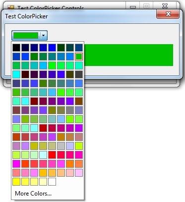
The ColorPicker control is a button that displays a colored box instead of text. You can set the Mode property to one of three values: ButtonOnly, DropDown and Split.
In the ButtonOnly mode, the control is just a clickable button. Use this mode when you want the user to be able to select a pre-defined color by clicking this button. For example, if there are only three color options, you might place three ColorPicker controls on a form with their Mode properties set to ButtonOnly. In this mode, the control does not display any palette.
In the DropDown mode, the control appears with a colored box and a small down arrow. Clicking anywhere on the button displays a drop-down palette. When the user selects a color from the palette, the control is updated to display that color.
Finally, in the Split mode the control provides the logic of both previous modes. In this mode (shown in the image above), there is a divider between the colored box and the down arrow. Clicking to the left of the divider raises the Click event but does not display any drop-down palette. Clicking to the right of the divider displays a drop-down palette. Use this mode to give the user a choice between quickly selecting a pre-defined color or choosing a new color from the palette.
This control propagates many of the properties from internal ColorPalette control. It also exposes the GetColorPaletteControl() method, which returns a reference to the internal control.
One final property is the MoreColorsButton property. Set this property to true to have the drop-down palette display an option to select additional colors. If the user clicks this option, the standard color dialog box is displayed. If the user chooses a color from this dialog box, the Click event is raised just as though the color had been selected from the drop-down palette.
The ColorToolStripButton Control

This is the first control that can be placed directly in a ToolStrip container. It should appear as one of the available items in the ToolStrip designer.
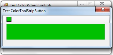
This control is very simple. Like the ColorPicker control in ButtonOnly mode, this control simply displays a colored box instead of text or an image. Clicking the button raises the Click event but does not display any color palette.
Use this control to allow the user to quickly select a pre-defined color from the toolbar.
The ColorToolStripDropDownButton Control

Finally, the ColorToolStripDropDownButton is another control that can be placed in a ToolStrip container. It should appear as one of the available items in the ToolStrip designer.
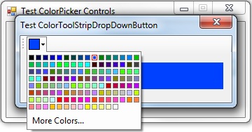
This control behaves like the ColorPicker control in DropDown mode. It displays a box with the current color and a small down arrow. Click the button to display a color palette.
Like the ColorPicker control, it exposes many properties of the underlying ColorPalette control and provides the GetColorPaletteControl() method. It also provides a MoreColorsButton property.
Conclusion
That concludes my overview of the controls I've presented. If they already meet your requirements, you may want to use them from the precompiled DLL. Just add a reference to ColorPicker.dll and then select the items to appear in the Visual Studio Toolbox.
Otherwise, one of the downloads contains the source code. You can include the original source files in your project, where you can tweak them as needed. Or maybe you just want more details on how they work.
End-User License
Use of this article and any related source code or other files is governed
by the terms and conditions of
.
Author Information
 Jonathan Wood
I'm a software/website developer working out of the greater Salt Lake City area in Utah. I've developed many websites including Black Belt Coder, Insider Articles, and others.